Asking customers to leave specific tip amounts before food is delivered or provided prompts larger gratuities but also leads to lower satisfaction – especially if the payment page design is crowded, I found in new research I co-authored.
My colleagues and I conducted three studies and a survey to explore how consumers are responding to the use of tip suggestions on digital payment devices. All participants for the study were recruited via the crowdsourcing website Mechanical Turk and were required to have eaten out or experienced a similar service in the past 12 months and left a tip.

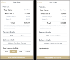
In our first study, we asked 134 people to imagine themselves ordering a large pizza that cost about US$28.97, including taxes and fees, from a local restaurant via a mobile app on their phones. They were shown a payment page similar in design to what you would find on apps like DoorDash and Uber Eats. Half of the participants viewed a payment page that noted “tipping optional” next to an empty box into which users could enter a gratuity if they so chose. The other half saw specific tip suggestions, 15%, 20% and 25%, as well as a “custom” option. We highlighted 20% as the default.
We then asked them to rate how they felt about the paying experience, whether they felt manipulated and how much they would tip. We found that participants who saw specific suggestions gave significantly higher tips but also reported feeling manipulated and more dissatisfied with the experience.
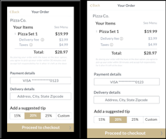
In a second study, we wanted to test whether the design of the payment page made much of a difference. Past research on spatial crowding has found that less-crowded screens are less stressful to consumers and make them less likely to react emotionally. So we replicated the first study with 280 more participants with the two tipping options; half of them viewed a relatively cluttered design, while the rest saw more white space between words and graphics.

Fan, Wu, Liu (2022)
We found that people still tipped more when given suggested amounts. But the less-cluttered design resulted in less dissatisfaction in the payment experience.
Our final study repeated the same basic structure of the second except we had our 201 participants view the payment pages – cluttered or spaced out – on a computer. We found similar results, with tip suggestions yielding higher gratuities and a crowded design resulting in more dissatisfaction than a spacious one.
Finally, we conducted a survey and found that people said they’re more likely to patronize a restaurant and say positive things about it if the digital payment experience is a good one.
Why it matters
Whether ordering a cappuccino at a cafe or a pizza from a delivery app, it seems like we’re all being increasingly asked to tip before tasting our food or experiencing delivery or other service. A point-of-sale provider recently reported that about half of its “quick serve” clients, like cafes and bakeries, and almost a quarter of all its merchants used the suggested tip feature on their payment screens.
And of course tips are important for the workers who depend on them. Gratuities make up a significant amount of service workers’ take-home pay. Servers, for example, earn over half of their incomes on tips alone.
Our research shows suggesting tip amounts is indeed effective at increasing tip amounts. But this comes at a cost when consumers feel manipulated into forking over more money before their pizza or coffee has even arrived. Our survey showed that this may lead people to avoid ordering from a given restaurant in the future.
Companies can use a less-cluttered payment interface to hold on to more customers.
What’s next
We hope to do further research on how different social cues, such as explaining to customers the importance of tips to delivery and other service workers, might affect customer satisfaction when using the tipping feature of digital payment apps.![]()
Alei Fan, Assistant Professor of Hospitality and Tourism Management, Purdue University
This article is republished from The Conversation under a Creative Commons license. Read the original article.

