On Sept. 9, many West Coast residents looked out their windows and witnessed a post-apocalyptic landscape: silhouetted cars, buildings and people bathed in an overpowering orange light that looked like a jacked-up sunset.
The scientific explanation for what people were seeing was pretty straightforward. On a clear day, the sky owes its blue color to smaller atmospheric particles scattering the relatively short wavelengths of blue light waves from the sun. An atmosphere filled with larger particles, like woodsmoke, scatters even more of the color spectrum, but not as uniformly, leaving orangish-red colors for the eye to see.
But most city dwellers weren’t seeing the science. Instead, the burnt orange world they were witnessing was eerily reminiscent of scenes from sci-fi films like “Blade Runner: 2049” and “Dune.”
The uncanny images evoked sci-fi movies for a reason. Over the past decade, filmmakers have increasingly adopting a palette rich with hues of two colors, orange and teal, which complement one another in ways that can have a powerful effect on viewers.
Writing color into the script
When we dissect movies in my design classes, I remind my students that everything on the screen is there for a reason. Sound, light, wardrobe, people – and, yes, the colors.
Actor, writer and director Jon Fusco has suggested “writing color as an entire character in your script,” since colors can subtly change the way a scene can “resonate emotionally.”
Set and costume designers can influence color palettes by sticking to certain palettes. But art directors can also imbue scenes with certain hues via “color grading,” in which they use software to shift colors around in the frame.
In her short film “Color Psychology,” video editor Lilly Mtz-Seara assembles a montage from more than 50 films to show the emotional impact intentional color grading can lend to movies. She explains how different palettes are used to emphasize different sentiments, whether it’s pale pink to reflect innocence, red to capture passion or a sickly yellow to denote madness.
The most powerful complement of them all
So why orange and teal?
In the 17th century, Isaac Newton created his “color wheel.” The circle of colors represents the full visible light spectrum, and people who work in color will use it to assemble palettes, or color schemes.
A monochromatic palette involves tints from a single hue – lighter and darker shades of blue, for example. A tertiary palette divides the wheel with three evenly spaced spokes: bright reds, greens and blues.
Among the most striking combinations are two hues 180 degrees apart on the color wheel. Due to a phenomenon called “simultaneous contrast,” the presence of a single color is intensified when paired with its complement. Green and purple complement one another, as do yellow and blue. But, according to German scientist, poet and philosopher Johann Wolfgang von Goethe, the strongest of the complementary pairings exist in the ranges of – you guessed it – orange and teal.
For movie makers, this color palette can be a powerful tool. Human skin matches a relatively narrow swath of the orange section of the color wheel, from very light to very dark. A filmmaker who wants to make a human within a scene “pop” can easily do so by setting the “orange-ish” human against a teal background.
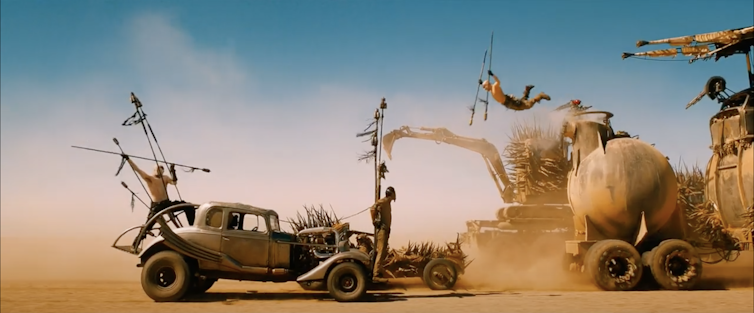
Filmmakers can also switch between the two depending on the emotional needs of the scene, with the oscillation adding drama. Orange evokes heat and creates tension while teal connotes its opposite, coolness and languid moodiness. For example, the orange and pink people in many of the chase scenes in “Mad Max: Fury Road” stand out against the complementary sky-blue background.

Oranges and teals are not the sole province of sci-fi movies. David Fincher’s thriller “Zodiac” is tinged with blues, while countless horror movies deploy a reddish-orange palette. There’s even been some backlash to orange and teal, with one filmmaker, Todd Miro, calling their overuse “madness” and “a virus.”
Nonetheless, given the frequency with which sci-fi films wish to subtly unsettle viewers, the palette continues to find frequent application in the genre.
As for West Coast residents unnerved by the murky air and bizarre landscapes, they’re probably wishing their lives felt a lot less like a movie.![]()
Johndan Johnson-Eilola, Clarkson University
Johndan Johnson-Eilola, Professor of Communication and Media, Clarkson University
This article is republished from The Conversation under a Creative Commons license. Read the original article. https://creativecommons.org/licenses/by-nd/4.0/