
Millennial pink, gen Z yellow, brat green… Tell me your favorite colors, and I’ll guess your generation
Although each generation seems to adopt a particular palette, it would be simplistic to view this as a biological or universal phenomenon. While color is the visual effect produced by the spectral composition of light that is emitted, transmitted or reflected by objects, how we interpret it is above all a social and cultural construct, shaped by customs, ideologies and media influences.
As French historian Michel Pastoureau, points out, colors are not created by nature – nor solely by the eye or the brain – but by society, which assigns them different meanings depending on the era. They thus become a kind of indicator of the transformations of each decade.
In the chapter section titled la Couleur, marqueur créatif générationnel? (Colour: a generational creative marker?) recently published in les Dessous de la créativité – gagner en confiance créative et relever les défis (The Secrets of Creativity: Gaining Creative Confidence and Overcoming Challenges), we explore how successive generations are defined by sets of values, beliefs and behaviors that also manifest visually – most notably through their own distinctive colors.
Segmenting by generation – boomers, X, Y, Z, Alpha – thus allows us to observe chromatic preferences that are not merely matters of individual taste, but reflections of a collective relationship to time, aspirations and dominant aesthetics.

Each generation has its own color code
Baby boomers (born between the end of the second world war and the mid-1960s) and generation X (1965 to 1980) gravitated toward more traditional palettes, with a dominance of neutral and pastel tones. From the 1970s on-wards, these were enriched by earthy hues drawn from nature – greens, browns and rust reds.
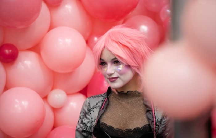
Generation Y, or millennials (1980 to mid-1990s), saw the rise of an iconic color: millennial pink. More than just a hue, this soft pastel became emblematic in the 2010s – symbolizing lightness, optimism and, above all, a challenge to traditional gender codes.
For generation Z (1995–2010), the first standout shade was a bold yellow, quickly dubbed gen Z yellow, which emerged around 2018 in deliberate contrast to their predecessors’ pink. Soon after, purple entered the mix – long associated with power, creativity and feminist struggles, and now reinterpreted as a symbol of inclusivity and self-expression. More recently, green has gained ground. On one hand, it has become a rallying color for ecological concerns and in political discourse; on the other, it has been reinvented as the provocative, screen-bright brat green, popularised in 2024 by British singer Charli XCX.
Generation Alpha, still in its early years, moves between two poles: a pull toward natural, comforting tones, and early immersion in the saturated, artificial colors of the digital world.
Being rooted in one’s time
While these generational markers are compelling, they should not be taken as fixed. Colors are never static: they circulate, evolve, and reinvent themselves. They return in cycles, much like fashion, and take on new meanings along the way. This fluidity is what gives color such power in communications. It anchors a brand in its era, while also leaving space for reinterpretation.
The latest trends for 2024–2025 make this clear. Alongside the neon green tied to Charli XCX’s album “Brat”, Pantone has named Mocha Mousse, a warm, indulgent brown that speaks to a collective yearning for comfort and stability, its 2025 Color of the Year. The contrast between these two signals – one ironic and exuberant, the other quiet and reassuring – captures the spirit of our moment, poised between excess and a quest for balance.
The power of color naming
Research in marketing also shows that a colors impact lies not just in the hue itself, but in how it is named.
The name given to a color directly shapes consumer preference and purchase intention. An evocative, poetic or playful name generates far more engagement than a generic label. This phenomenon – still under explored – reminds brands that language can shape perception just as strongly as color does. But humor or quirkiness must be handled with care: too much can blur brand recall, making balance essential.
For companies, the challenge is twofold. First, to understand the generational codes that shape how colors are read and received, so they can speak in an instantly recognizable visual language. Second, to build a color system that remains coherent and sustainable over time.
Talking about generational colors is therefore a useful decoding tool – provided we recognize its flexibility. For every generation, color is more than an aesthetic choice: it is a carrier of meaning, a witness to its time, a source of emotion, and a shared language that binds individuals to the spirit of their age.
Sabine Ruaud, EDHEC Business School and Rose K. Bideaux, Université Paris 8 – Vincennes Saint-Denis
Sabine Ruaud, Professeur de marketing, EDHEC Business School and Rose K. Bideaux, Chercheur·e en arts et en études de genre, Université Paris 8 – Vincennes Saint-Denis
This article is republished from The Conversation under a Creative Commons license. Read the original article.
Every product is selected by editors. Things you buy through our links may earn “The IRL News” a commission.